Posts

Web Design Principles

A few websites I enjoyed were,  Design of the World   I really liked the lay out of this website and I enjoy how it functions. I think that the look of it is very neat and tidy. I enjoy the different pops of color that I see when I scroll through it. I think that when I design my website I might try and recreate the lay out that it has or try and use the same kinds of colors and or just try and take the qualities I liked the most and out it into my own website. Another website that I  kind of enjoyed was, Inspiration Grid , I liked how this website was also laid out, I liked how it showed you what kind of material was going to be on the website right once you click on it. I don't know if I'll put much of these elements into my own website because I think that it is similar to the old one but I did like it. The last website i'm going to talk about is  Deviant art  I really liked what I seen when I first clicked on this website. I liked how I instantly ...

Exploring website elements

https://docs.google.com/drawings/d/1Uyqz2e6vHzNWJ_mVOsuQKnvziGti3wzk2aO8CxqharY/edit?usp=sharing

Magazine Cover

Image
The Principles of Design: Balance/ Contrast There is contrast between the background photo and the photos that I put on the side of the cover. Rhythm/ Repetition A repetition that I noticed on mine was that I have the photos all on one side, they're the exact same width and I also have all the words on the other side of the magazine cover. Emphasis/ Alignment I didn't put much emphasis in my cover, I just put my name and the price in black to make it stand out. Unity/ Proximity I kept the size of my text relatively the same and the font has all different types. I changed the colours but I picked colours that were already used  in the background to make it all match. I chose pictures with all the same similar shape to look well on the background.

The Principles of Design

Image
Balance/ Contrast  - They're repeting the marshmallows all over the cover of the magazine  -They have the photo of Micheal Jackson on the middle of the page  -They have small blocks of text all around the centre image to balance out the cover Rhythm/ Repetition -They have the same legnth and color text on each side of the magazine cover  Emphasis/ Alignment  -They put the name of the magazine in a white color to make it stand out and also put it on a angle while all the other text on the cover is stright -They use black text when they put the date on there, also when they put what the magazine was, which was the third thing I looked at when I seen the cover  -They used a pink color for the side texts  Unity/ Proximity  - They only use two size fonts it looks like and looks like they only used two different styles  - Font doesn't change much throughout the cover - They don't really have a ton of colored text ...

Photo Composition Principles

Image
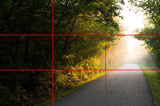
Rule of Thirds - Imagine that your image is divided into 9 equal segments by 2 vertical and 2 horizontal lines. The   rule of thirds  says that you should position the most important elements in your scene along these lines, or at the points where they intersect.  Doing so will add balance and interest to your photo. Some cameras even offer an option to superimpose a rule of thirds grid over the LCD screen, making it even easier to use. Framing - The world is full of objects which make perfect natural frames, such as trees, archways and holes. By placing these around the edge of the composition you help to isolate the main subject from the outside world. The result is a more focused image which draws your eye naturally to the main point of interest. Leading Lines - When we look at a photo our eye is naturally drawn along lines. By thinking about how you place these   leading lines   in your composition, you can affect the way we view the image, pulling u...

What is Public Domain and Creative Commons

Image
      The first website that I went on was this one https://www.pond5.com/free. The first thing I seen when I went on the website was a big title named the public domain project explaining what the website was, it says after the title on this website that, it says that you can download thousands of historical media and it also says on it that it is completely free and made available by Pond5. I like this website and how its all set up, how you can just click on certain titles, and it all comes up and it shows you that its free even before you pick it up. The seconds website I went on was thehttps://search.creativecommons.org/ website. The first thing I seen when I went on the website were a bunch of things that you can click on but it's stupid because it wont take you to the actual website, I think if they fixed that it would be used a lot more and would be more handy. I wouldn't think to just go on this website and look for free places to find videos and stuff I would ju...

Fair dealing and copyright in Canada

There are eight fair dealing purposes which may not infringe copyright, they are, research, private study, criticism, review, news reporting, education, satire and parody. Copyright is put in place to protect peoples work, but there is ways that you can use work in certain situations without getting into trouble. I think that copyright is important to have because if it wasn't there people could copy anyones work and hand it into teachers as their own.        If a student was doing a News Report, they can copy an entire article for just the porpose of education. The place that the report is being done on must have a password to the sysytem, somewhere not anyone can just access.        If a student is doing research, the work is from a copyright- protected work. The student is able to copy the entire artistest work for the porpose of research. If you are planning on publishing the research though you can not include a picture of the artists wor...